How To Create Flexible Images And Media In CSS Layouts

“A flexible layout isn’t all that flexible if some of the component parts are fixed. Text easily reflows as it’s container resizes, but what about images and other media? How do we make them flexible to keep our layout flexible?
Last week we talked about elastic layouts and flexible grids. Next week we’ll look at media queries. We’re building toward responsive layouts by discussing each of the 3 parts necessary for responsive design in a separate post.
All the credit here belongs to Ethan Marcotte and I recommend his post on flexible images. I also highly recommend Ethan’s new book on responsive design.
Also Richard Rutter has set up a page experimenting with flexible images using max-width that’s worth checking out.”
Why You Should Start Using HTML5 & CSS3 Today

“For a while now, we have taken notice of how many designers are reluctant to embrace the new technologies such as CSS3 or HTML5 because of the lack of full cross-browser support for these technologies. Many designers are complaining about the numerous ways how the lack of cross-browser compatibility is effectively holding us back and tying our hands keeping us from completely being able to shine and show off the full scope of our abilities in our work. Many are holding on to the notion that once this push is made, we will wake to a whole new Web full of exciting opportunities just waiting on the other side. So they wait for this day. When in reality, they are effectively waiting for Godot.
Just like the elusive character from Beckett’s classic play, this day of full cross-browser support is not ever truly going to find its dawn and deliver us this wonderful new Web where our work looks the same within the window of any and every Web browser. Which means that many of us in the online reaches, from clients to designers to developers and on, are going to need to adjust our thinking so that we can realistically approach the Web as it is now, and more than likely how it will be in the future.
Sometimes it feels that we are hiding behind the lack of cross-browser compatibility to avoid learning new techniques that would actually dramatically improve our workflow. And that’s just wrong. Without an adjustment, we will continue to undersell the Web we have, and the landscape will remain unexcitingly stale and bound by this underestimation and mindset.”
Wireframing is About More than Just Visual Layout
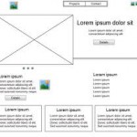
“Over the past couple of days, I have been working on an initial concept/prototype for a new, interesting website. As I normally like to do whenever I am tackling a new project, I started by opening up a notebook and making a few really simple layout sketches for how I initially thought the page should be laid out (at this stage, I am just working the layout for a single type of page, with others following later). After discussing these initial concepts with members of the team I am working with, I very logically moved on to the creating more fully realized wireframes. For me, this meant printing of some grids and using a pen to draw and label content boxes.
The process, however, started me thinking about wireframes, their importance and the role(s) that they play in the design and development process. More specifically, it got me thinking about how wireframing even in the rudimentary pencil on a paper grid method that I use may be even more important and useful than it may initially appear, or than we like to give it credit for.”
Quick And Easy Ways To Make Your Headlines Rock!
“Headlines are one of the most important elements on your page and are often the starting point that sets the tone for the entire design. So why not make them great?
Today we’ll take a look at seven different design techniques that you can implement in a minute or less that will boost your headline from plain to awesome.
We’ll start with the most typical and basic trick on the list. One of your most powerful tools for creating headlines is contrast, which we’ll be using again and again throughout this post…”
Extending the Functionality of WordPress (Part 1)

“For a platform that started its life as solely a platform for blogging, WordPress has come a long way over the last few years. It’s certainly earned the right to be known as the most popular Content Management System (CMS) on the net with speculation that between the self hosted script and its hosted service WordPress.com, it powers over 25% of the web (WordPress.com exceeded 50 million websites last week!).
Theme designers and plugin developers have been pushing the boundaries of what WordPress can do for some time. This has accelerated since the introduction of Custom Post Types into the WordPress core as it allows developers to use WordPress in a lot of weird and wonderful ways.
Today we will begin showing you examples of themes and plugins that let you use WordPress in ways you may have never thought possible. Most of the newer themes and plugins in this list use custom post types however some older scripts still use a custom solution.”
What is Your Website’s Tone of Voice?
“There are two branches of Starbucks near my office, but I will always go to the one that’s slightly further away. Both sell exactly the same products, the decor is identical, and the queues are always a similar length.
Why go to the one that’s further away? I like the way the barista talks to me.
Although the content of our brief exchanges is no different from the conversation I’d have at the other branch, there’s something very different about how this interaction sounds and feels: tone.”
How To Create Better One Page Websites
“One-page websites are hot and popular no doubt about that. But they aren’t for everyone or every business. It’s easy to want one because they’re popular; and if done correctly, yours could be a hit. But make sure you’re project qualifies first.
A good candidate for a one-page website is not super-heavy on content. You only have one page to get your point across, and there are only so many animations and tricks you can throw in before they get stale.
Plus, most one-page websites are unconventional in their layout. Trying to fit a lot of content onto one page without looking cluttered is pretty tough.
Potential uses vary, but some of the most popular candidates for one-page websites are personal portfolios and websites for businesses that sell only a few products or services.
If you qualify, make sure your website hits the mark. There are always certain things you have to follow through on when making any website, but the points below are especially critical to single-page websites.”
CSS Menus for Responsive Web Design
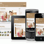
“Responsive design and layout are the hot topics of today in the Web Design industry. More and more emerging ideas and methods are being developed every day. Sometimes all of this can seem like information overload.
In this article Chris Coyier of CSS Tricks does a great job focusing on one very important aspect of responsive design – what in the world do I do with my menus?”
10 Important UI Design Considerations for Web Apps
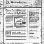
“When I finished building my first web app (CompVersions, which allows you to collect feedback from clients), I was surprised at the number of user interface decisions and considerations I hadn’t accounted for at the beginning of my journey. I’d like to share some of those things with you.
Many of these design considerations might seem superficially obvious, but once you’re going through the design and development process, it’s easy to forget about them because they’re like condiments you hardly notice them when they’re there, but if they’re missing, your food just doesn’t taste right.
Blank State
The blank state is how your app will look and function when the user hasn’t entered any data yet (except perhaps their email address after signing up for an account). This is the first interaction and scenario that your user will encounter with your app and it can make or break their first experience and impression.”


