5 Reasons to Optimize Your Site for Mobile

“It seems like the whole world has a smartphone these days. As of December 2010, a reported 31% of all US mobile phones were smartphones.
That means there’s likely to be a LOT of people viewing your website on a mobile device. Do you know what kind of experience those people have on your site? Does your site have a dedicated mobile version?
Here’s 5 reasons why we think it should.”
What is Responsive Web Design And How Can I Use It?

“Almost every new client these days wants a mobile version of their website. It’s practically essential after all: one design for the BlackBerry, another for the iPhone, the iPad, netbook, Kindle and all screen resolutions must be compatible, too. In the next five years, we’ll likely need to design for a number of additional inventions. When will the madness stop? It won’t, of course.
In the field of Web design and development, we’re quickly getting to the point of being unable to keep up with the endless new resolutions and devices. For many websites, creating a website version for each resolution and new device would be impossible, or at least impractical. Should we just suffer the consequences of losing visitors from one device, for the benefit of gaining visitors from another? Or is there another option?
Responsive Web design is the approach that suggests that design and development should respond to the user’s behavior and environment based on screen size, platform and orientation. The practice consists of a mix of flexible grids and layouts, images and an intelligent use of CSS media queries. As the user switches from their laptop to iPad, the website should automatically switch to accommodate for resolution, image size and scripting abilities. In other words, the website should have the technology to automatically respond to the user’s preferences. This would eliminate the need for a different design and development phase for each new gadget on the market.”
Real World CSS Practices

“By now, I think it’s safe to say that most designers on the web are using CSS in some capacity. Even those (misguided) individuals who are still using table-based layouts have a tendency to use CSS for some basic styling, such as establishing fonts and link colours. With that in mind, I thought it might be worthwhile cover some of what I have found to be best practices.
Before getting started, it’s important to note that these are practices and habits that I have developed based on my own experience, which includes developing different sites, my own experiments and reading from a variety of sources. While I have my own reasons for the way I do things, I am in no way presenting the following as CSS gospel that absolutely needs to be followed.
As with anything, take what you read, weigh it against your own knowledge, values and experience in order to formulate your own methodology.”
Why Users Fill Out Forms Faster with Top Aligned Labels

“Imagine a user who is really excited about your product or service. They’re ready to sign up, so they go to your form page and start filling out their information. The way you align your labels with your form fields can affect how easy it is for users to fill out the form. Do you want to give users a quick, easy and painless experience or do you want to give them a hassle? If you want to make their experience quick, easy and painless, consider using top aligned labels for your form fields.”
Wireframing is About More than Just Visual Layout

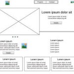
“Over the past couple of days, I have been working on an initial concept/prototype for a new, interesting website. As I normally like to do whenever I am tackling a new project, I started by opening up a notebook and making a few really simple layout sketches for how I initially thought the page should be laid out (at this stage, I am just working the layout for a single type of page, with others following later). After discussing these initial concepts with members of the team I am working with, I very logically moved on to the creating more fully realized wireframes. For me, this meant printing of some grids and using a pen to draw and label content boxes.
The process, however, started me thinking about wireframes, their importance and the role(s) that they play in the design and development process. More specifically, it got me thinking about how wireframing even in the rudimentary pencil on a paper grid method that I use may be even more important and useful than it may initially appear, or than we like to give it credit for.”
Quick And Easy Ways To Make Your Headlines Rock!

“Headlines are one of the most important elements on your page and are often the starting point that sets the tone for the entire design. So why not make them great?
Today we’ll take a look at seven different design techniques that you can implement in a minute or less that will boost your headline from plain to awesome.
We’ll start with the most typical and basic trick on the list. One of your most powerful tools for creating headlines is contrast, which we’ll be using again and again throughout this post…”
What is Your Website’s Tone of Voice?

“There are two branches of Starbucks near my office, but I will always go to the one that’s slightly further away. Both sell exactly the same products, the decor is identical, and the queues are always a similar length.
Why go to the one that’s further away? I like the way the barista talks to me.
Although the content of our brief exchanges is no different from the conversation I’d have at the other branch, there’s something very different about how this interaction sounds and feels: tone.”
How To Create Better One Page Websites

“One-page websites are hot and popular no doubt about that. But they aren’t for everyone or every business. It’s easy to want one because they’re popular; and if done correctly, yours could be a hit. But make sure you’re project qualifies first.
A good candidate for a one-page website is not super-heavy on content. You only have one page to get your point across, and there are only so many animations and tricks you can throw in before they get stale.
Plus, most one-page websites are unconventional in their layout. Trying to fit a lot of content onto one page without looking cluttered is pretty tough.
Potential uses vary, but some of the most popular candidates for one-page websites are personal portfolios and websites for businesses that sell only a few products or services.
If you qualify, make sure your website hits the mark. There are always certain things you have to follow through on when making any website, but the points below are especially critical to single-page websites.”
CSS Menus for Responsive Web Design

“Responsive design and layout are the hot topics of today in the Web Design industry. More and more emerging ideas and methods are being developed every day. Sometimes all of this can seem like information overload.
In this article Chris Coyier of CSS Tricks does a great job focusing on one very important aspect of responsive design – what in the world do I do with my menus?”


